Showing posts with label 2013. Show all posts
10.13.2013
10.07.2013
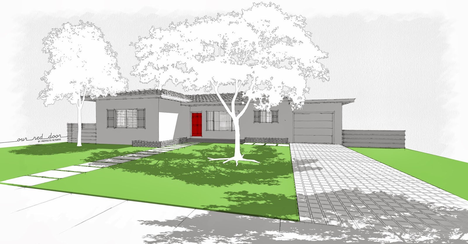
{ FRONT YARD: HARDSCAPE DESIGN }
…we’ve always loved Turfblock... yes,
they are messy, high maintenance, and spotty (as in grass grows inexplicably in
some “holes” and not others). nevertheless, for two years, every time we spoke
about redoing the driveway, we spoke about Turfblock. however, when the time
actually came, doubt started setting in. we were not sure we could deal with
the maintenance and inconsistency. knowing we wanted a permeable option, my
dear friend Jose—who I met my first day of architecture school, now many moons
ago—owner of BrickPaver Group, suggested we use Rima pavers. Rima
is an interlocking paver system that offers two installation options; “nub to
block” which creates a seamless surface still allowing for percolation or “nub
to nub” for a larger gap and increased permeability.
![]() |
| Photos courtesy of: www.sislersstone.com and www.tremron.com |
the Turfblock allows for sod growth, increasing the green area of the yard; while the Rima offers lower maintenance and cleaner lines. we loved the aesthetics and functionality of both systems, so it was not an easy decision…
thankfully, making a decision on the walkway, was easier. we
narrowed it down to two options [also illustrated above]; 24” x 24” precast
concrete pavers or larger 24” x 48” poured-in-place “pavers.”
if you can’t wait till the next post to find out what we decided,
follow us on Instagram! @ourreddoor
Labels:
2013,
architecture,
driveway,
front door,
front yard,
home,
house,
landscape,
modern,
pavers,
permeable pavers,
plans,
red door,
remodel,
renderings,
renovating a home,
renovation,
rima,
sketch,
turfblock
10.06.2013
{ BACK YARD: WALL PLANTERS }
…it’s been a while since we showed the back yard some love; and even
though it still needs a lot of work, adding a little green is always a step in
the right direction. as with every other wall in the house, we had three or
four possible options for the rear wall of the garage; until we came across
these awesome chalkboard wall planters and holder brackets from West Elm. we fell
in love with these instantly. we liked the idea of creating a random pattern,
so we used painters tape in different sizes, representing the various sized
pots, to arrange the pattern on the wall.
…even though we stalked three West Elm stores—and even had a very
helpful sales person remove the pots and holder brackets off the store display installation,
so we could buy them—we were short four small pots. knowing Rust-Oleum makes
chalkboard spray paint, we thought we could create our own version for the
small pots. we were right, you can’t tell the difference.
…loved adding succulents and herbs to our wall.
9.02.2013
{ KITCHEN: PROGRESS 2 }
…after the rough plumbing and electrical, drywall, and tiling were
done, the cabinet and countertop installation began.
…once the countertop and backsplash were in, the back-painted glass backsplash was installed. after that, we installed the hood, shelves, magnetic knife strip, and spice racks.
…and finally, the drawer fronts and doors were installed.
…once the countertop and backsplash were in, the back-painted glass backsplash was installed. after that, we installed the hood, shelves, magnetic knife strip, and spice racks.
…and finally, the drawer fronts and doors were installed.
8.25.2013
8.21.2013
{ KITCHEN: DESIGN: FINISHES }
Resources:
Countertop: Compac Quartz Luna
Tile: Atlas Concorde Studio White
Appliances: Stainless Steel - GE Café and Monogram
Backsplash: Back-Painted Glass
Wall: Chalkboard Paint
For local resources, please contact us.
Labels:
2013,
architect,
design,
fixing,
home,
house,
interior design,
kitchen,
kitchen design,
midcentury modern,
modern,
modern ranch,
remodel,
renderings,
renovating a home,
renovation
8.15.2013
{ KITCHEN: DESIGN: LAYOUT }

…we love to cook …well, Manny loves to cook, I love to do some of the prep work, prepare cold dishes and appetizers, plate, and stand around with a glass of wine while he does the cooking... so, we spend a lot of time in the kitchen. aside from needing a major make-over, the kitchen layout was not conducive to that. therefore, the goal was not only to update the kitchen, but to reconfigure the layout to make it work for us. in order to do this, the new design needed to:
· “feel bigger,” as it is a small kitchen (120 SF);
· be efficient;
· provide more counter space and distinct prep areas;
· provide more storage area;
· provide functional storage areas;
…and last
but, definitely not least, this one is difficult:
· have the right balance between form and function
…redesigning the kitchen entailed:
· inverting the location of the refrigerator and
range. the previous layout felt small because every wall plane was broken up.
this change creates an unobstructed wall, opening up the space; inverting these
appliances also creates a better flow or “work triangle;”
· removing
the unnecessary soffit. the result of this was instantaneous; immediately it felt
as though the volume had grown;
· extending
the partition wall to create additional counter area. creating a separate prep
area, outside the triangle, eliminates
path conflicts and unintentional
toe-stepping. as it turns out, there was no actual net gain in counter area [I
had to do the math twice]; however, increasing their functionality, creates the
illusion that counter area was added;
· using
every inch of space by designing floor-to-ceiling custom cabinets;
· using
open shelving in lieu of upper cabinets to maintain the “openness.” In spite of
eliminating upper cabinets, the usable storage area increased by 40%;
· shifting the location of the sink. in order to
maximize storage areas, the dishwasher had to be moved to the exterior wall; in
order for it to fit on that wall, the sink had to shift from its location (centered
on the window). …and no, it doesn’t bother us that it is off-center. symmetry
is overrated;
· removing the ceiling fan. it had to be done; and
· installing recessed light fixtures. the lighting
placement was perfected by our light-savvy friend, Hector, whose only direction
was “It needs to be bright and Manny does not want to see his own shadow as he
is chopping away on the counter.” not only did he accomplish this, but he also successfully used lighting to emphasize design
elements.
…take a look:
...existing plan:
...proposed plan (roll over the image):
...interior elevations:
Labels:
2013,
ceiling fan,
design,
fixing,
home,
house,
interior design,
kitchen,
kitchen design,
light fixtures,
midcentury modern,
modern,
modern ranch,
plans,
progress,
red door,
remodel,
renovating a home,
renovation,
sketch
Subscribe to:
Posts (Atom)